How to mix patterns in a beachy living room
A layered beachy interior comes from coordinating the room’s visual rhythm, not from filling every surface with coastal symbols. Stripes, botanical prints, checks, wave motifs and small geometric repeats can share the same room when colour, scale and texture connect them.
A successful scheme starts with the room’s architecture, furniture and natural light. The best beachy interiors feel breezy and tactile rather than themed, so the pattern work should support a relaxed atmosphere. Linen-look upholstery, pale timber, woven fibres and gently curved furniture provide a quiet foundation.
For Australian spaces, this approach also has to work hard. Strong sunlight, salt-laden coastal air, sand tracked indoors and relaxed open-plan family life all influence which patterns stay practical. Balancing decorative layers with washable materials and ample breathing room keeps the room welcoming.
Begin with a coastal colour base
Choose a limited ocean-inspired palette of chalk, sand, oatmeal, eucalyptus, sea glass, muted blue and warm terracotta. These shades create a background that lets pattern carry the eye without making the room loud. Keep walls and large furniture mostly quiet, then distribute stronger colour through cushions, rugs and artwork.
A useful rule is to repeat each accent colour in at least two places. Navy in a striped blind can reappear in a ceramic pot or chair legs, while rust in a floral print can return in a leather ottoman. This repetition makes unrelated motifs feel connected and gives a layered scheme a clear visual path.
Layer natural texture and pattern
Texture is the glue in a coastal pattern mix. Combine smooth painted timber with nubby linen, braided jute, seagrass, cane, wool or softly slubbed cotton. These organic materials keep synthetic-looking prints from feeling flat, and the mix of rough and refined surfaces suits the easy character of a beach-inspired home.
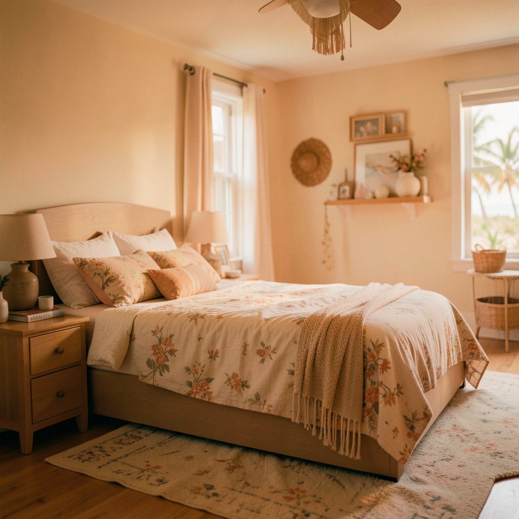
Build layers from large to small: a broad rug under the sofa, a textured throw over one arm, patterned cushions against the back, then a small motif on a side table. Vary the pattern density as well as the pattern itself. Dense geometrics beside a simple stripe can feel energetic, while two delicate botanicals may drift into a soft, indistinct wash.
Combine motifs without visual noise
A disciplined pattern mix usually works best with two or three motif families. Choose one anchor, such as wide coastal stripes, and one contrasting family, such as faded botanicals or small checks. A third pattern can be tonal, using the same shapes in closely related shades. This keeps the room varied without turning every surface into a focal point.
A clear visual hierarchy makes those relationships easy to read. Pair patterns for connection rather than identical colours. Curved wave shapes balance angular checks, while vertical stripes offset small horizontal florals. A bold graphic can share a palette with a plain woven ground. Organic motifs generally sit comfortably beside stripes, while crisp geometry can make rustic fibres and faded colour feel unexpectedly polished.
Repeat each motif in only a few deliberate places. Three different designs across three matching cushions can feel busy, whereas the same stripe on a blind, a cushion edge and a framed print reads as intentional. Use a solid piece between pattern moments to reset the eye, especially around the main sofa or dining area.
Match pattern scale to the room
Match scale to the surface. A large repeat on a full-height curtain can overpower a small room, while tiny checks stretched across an oversized rug can disappear from the sofa. Let major furniture and architectural elements carry the larger motifs, and reserve small patterns for compact objects. Before buying, view a sample from the actual seating distance.
Negative space is just as important as contrast. Leave a clear stretch of wall beside the main arrangement, keep the coffee table lightly styled and resist filling every corner. A room with breathing room feels coastal and calm; a room packed with equal-strength prints feels restless, even when the colours agree.
Plan for Australian light and weather
Strong light changes pattern. Sydney and Brisbane homes often receive intense ultraviolet exposure, which can fade dyed fibres and weaken delicate colours over time, while Melbourne’s changeable daylight can make the same palette look cooler or warmer by the hour. Test fabric swatches in the window, choose UV-stable curtains and rotate cushions so wear is spread.
Coastal humidity and salt can affect colour, metal fittings and natural fibres. Keep seagrass and jute away from permanently damp walls, use washable covers where hands and pets make contact, and wipe salt from timber and painted surfaces. Cotton and wool suits often combine durability with the relaxed texture associated with coastal decorating, provided care labels are followed.
Australian open-plan living rooms often host barefoot children, pets, wet swimmers and weekend barbecues, so patterns need to survive everyday use. Washable rugs, removable slipcovers and tightly woven upholstery reduce the impact of spills and sand. A little imperfection suits the relaxed look better than protecting the room so carefully that it cannot be lived in.
Choose pieces that suit local homes
Australian shoppers can find neutral bases and coastal accents through retailers such as IKEA Australia, Freedom and Adairs, while Australian wool rugs, timber pieces and woven baskets add locally relevant texture. Compact apartments need careful measurement, so check the sofa, rug and doorway dimensions before buying; a layered scheme should not block circulation around the coffee table.
Secondhand furniture can supply the best patina for a beachy room. Check structural condition, cleanability and measurements through Gumtree, Facebook Marketplace or local op shops, and plan for an afternoon of refinishing where needed. Responsible design includes mending, reusing and buying fewer pieces, an approach that can complement a wider commitment to protecting human life. In practical terms, choose items that can be cleaned, repaired and kept in service for years.
New purchases deserve the same attention. Under the Australian Consumer Law, consumer guarantees cover goods of acceptable quality and goods fit for a disclosed purpose, and retailers must honour those rights. Keep the receipt, check care instructions and confirm that a rug or cushion cover can be cleaned before colour and pattern win your attention.
Create a balanced final scheme
Place the boldest pattern where people naturally pause, such as a statement cushion opposite the main seat or a framed print near the hallway, rather than scattering every strong design across the room. Keep patterns at different heights so the eye can travel between them. A large rug can link the sofa and occasional chairs before the cushions introduce smaller details.
Finish with lighting and greenery. A warm, dimmable lamp softens printed blues and greens, while a simple ceramic vessel or branchy stem adds movement without another competing motif. Check the room from seated and standing positions, then adjust or remove one layer if the arrangement feels crowded. Cohesion comes from repeated colour and texture, not identical objects.
Create a compact palette first, choose one anchor pattern and one quieter counterpoint, then layer texture around them. Keep the largest surfaces calm, reserve contrast for a few focal points and choose washable options that suit open-plan Australian life. Explore Joebolte’s curated coastal living room galleries, gather room references into a visual mood board and shop with a clear colour story. The result is a beachy interior that feels collected over time, easy to maintain and unmistakably your own.