Coastal Bedroom Colours That Go Beyond White and Blue
Coastal bedrooms in Australia have leaned on white walls and pale blue accents for decades, and there is a good reason for it: the look is clean, cool and instantly legible as seaside. But a room built entirely from that formula can end up feeling like a furnished holiday rental. The more interesting coastal bedroom wall colours now sit outside the obvious range — sand, sage, clay, eucalyptus — and they give a bedroom depth, warmth and a stronger sense of place.
The timing suits how Australian coastal homes actually live. In places like Byron Bay, Margaret River, the Gold Coast and the Mornington Peninsula, the sun arrives fierce, salt wind scours the verandah, and summer heat lingers well into the night. A flat white wall can glare in the afternoon and show every scuff and mark. A mid-tone wall softens that glare, takes a little heat and makes the ceiling look higher. Colour becomes a functional choice here, not simply a mood.
Texture changes everything as well. Limewash, matte emulsions and sand-textured finishes behave completely differently from the same swatch brushed onto a fibro wall in a Queenslander cottage, a rendered wall on the Sunshine Coast or a crisp new build in Maroochydore. Before you commit, paint a sample pot in the corner that catches the morning light and leave it there for a full day and a full night.
The practical news is encouraging. Dulux and Taubmans boards line the shelves of nearly every Bunnings and Mitre 10 in the country, and current ranges lean heavily toward warm neutrals, putty and muted greens — precisely what coastal bedrooms need. You can also build the room around one feature wall, keep the ceiling, skirting and shutters crisp, and let the colour do the talking.
Why White and Blue Feel Predictable
White and blue are useful, but they have become the default rather than the destination. They also behave differently depending on where the light comes from. A west-facing Gold Coast bedroom in midsummer can bleach a pale blue until it reads as washed-out grey, while a blue-grey in a room with no direct sun can turn cold and thin. Neutral colours change character hour by hour; blue often does not.
The fix is not to abandon the classic coastal look but to treat it as a base layer. Keep the ceiling, window reveals and shutters in crisp white or a bright off-white, then give one wall something with more body. That single move shifts a familiar scheme into something with personality, and it costs a pot of paint rather than a renovation.
From there, the room can lean into other coastal cues that are not colour-dependent: a rattan headboard, a slatted timber battens screen, washed linen, a jute rug and a little brass. Colour becomes the accent that ties those textures together instead of the whole performance.
Sand, Stone and Driftwood Neutrals
Warm neutrals are the safest and most useful way to leave blue behind. Putty, oatmeal, warm greige, pale taupe and sand tones carry the same beachy associations as bleached driftwood and shell, but they sit closer to timber and skin tones, so they make a bedroom feel instantly settled. A soft oatmeal wall behind crisp white linen looks like sunlight on sand rather than a nautical print.
These neutrals are also kind to Australian conditions. They disguise the minor marks that salt air and busy households leave on walls, and their mid-tone reflectance keeps a room bright without the glare of pure white. Pair them with beachy materials: cane, woven seagrass, pale timber boards, unbleached cotton and a chunky knit throw.
One practical note matters in this climate. Ultraviolet levels in Australia are high, and strong coastal light will fade both fabric and paint faster than most people expect. Ask the paint counter for the light reflectance value, and consider a washable matte finish in a guest room or a high-traffic space. Finer sheen in a main bedroom is worth the extra care.
Seafoam, Sage and Coastal Green
Green is the easiest way to make a bedroom feel coastal without stripes, anchors or shells. Seafoam, celadon, sage and pale eucalyptus tones borrow their colours from shallow water, sand dunes and native scrub, and they read as calm even in a room with heavy furniture and lots of stored things. A soft sage wall behind a white bed and dark timber bed frame looks quietly expensive.
Green also solves the problem of a bedroom that opens onto a view. If the window looks over coastal garden ideas planted with banksias, coastal tea-tree and pandanus, walls in the same family pull the outside in, and the room suddenly feels deeper. This is especially useful where the garden is the only natural focal point and you would rather not compete with it.
For contrast, go a shade deeper with olive, eucalyptus grey-green or a muted forest tone behind a headboard. These darker greens work best with warm metals, aged brass and lots of natural wood, and they turn an ordinary bedroom into a proper retreat.
Terracotta, Clay and Warm Earth
Australia's own architecture makes earth tones feel at home here. Think red brick terraces in Sydney, terracotta roof tiles, the rendered walls of old coastal Queenslander cottages and even the rammed-earth walls used in Western Australian builds. A muted clay or terracotta wall references all of that history without quoting it, and it makes timber, leather and cane look richer by comparison.
These colours suit the climate too, because warm mid-tones handle late-afternoon sun particularly well. A west-facing bedroom painted in a soft burnt sienna or raw clay tone stays comfortable rather than glaring, and it frames white bedding with a glow that reads as golden hour. Add a woven rug, a leather bedside stool and a shallow ceramic vessel, and the room feels complete.
The risk with earth tones is saturation. A genuinely red clay can feel heavy and dated in a small room, especially with cold lighting. Choose the muted, dusty versions instead, and keep the floor and ceiling pale so the warmth stays in the walls where you want it.
Coral, Blush and Soft Peach
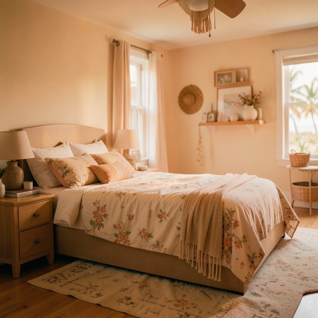
Australia has one of the harshest ultraviolet climates in the world, which means most Australian bedrooms fight against their light rather than working with it. That makes warm soft pinks more useful here than they are in cooler places. Coral, shell pink, dusty peach and pale apricot reflect light back into the room and give it a freshness that reads instantly coastal, closer to reef and shell than to candy.
These tones are also forgiving in the spaces people actually use them. A blush alcove beside a bath, a coral feature wall behind a child's bed, a soft apricot room under a verandah with a ceiling fan — all of them feel brighter without needing extra lamps or furniture. They pair naturally with white, pale timber, woven textures and a little greenery.
The trick is restraint. One wall in coral with everything else calm looks deliberate and polished. The same colour across every wall in a strong shade can tip into a 1980s feel, so pick the palest version and build from there.
Eucalyptus, Charcoal and Deeper Contrast
Coastal style is not automatically pale, and a darker bedroom can feel more restful than a bright one. Eucalyptus grey-green, ink blue-grey, charcoal, deep teal and midnight olive all work when the room is grounded with natural materials. Matte finishes are essential at this depth, because any sheen will show every roller stroke and reflect the wrong parts of the room.
Balance is what makes darker walls work. Keep the ceiling and window frames pale so the room does not feel like a cave, and fill the lower half of the space with linen, wool, jute and unfinished timber. A dark wall behind a cane headboard or a timber batten screen creates depth and texture that a flat painted surface cannot.
This is where Australian makers and joiners come into their own. Solid timber bed frames, plywood-lined alcoves, upholstered panels and custom cane inserts are all easier to source locally than elsewhere, and they soften what would otherwise be a very strong colour choice. Keep the classic Australian fittings in bright white too, particularly blackout roller shutters and ceiling fans, which stay crisp against a moody wall.
Bring Your Palette Together
A coastal bedroom colour scheme works best when it is layered rather than assembled from a single idea. Start with a base neutral for the walls and ceiling, add one feature tone for a single wall or alcove, then finish with a deeper accent in the textiles or joinery. Before the first brushstroke, get 125 millilitre sample pots of each colour and patch them in the room at three different times of day, because Australian light changes fast.
Then let the paint do the quiet work. A low-sheen or matte finish suits most coastal interiors, the timber and woven textures do the rest, and the wall colour simply holds the room together. A Bunnings colour mixing service can even match a shade from a photo of a room you admire, which helps when you are chasing a tone you cannot name.
Take a few photos of the patched corner in morning, midday and evening light, and compare them against the boards at your local Bunnings or Mitre 10. Pin the palettes that appeal in the Joebolte galleries, save them to a mood board, and shortlist three colours to test. Give the patch a week, live with it, and then paint the wall you keep coming back to.